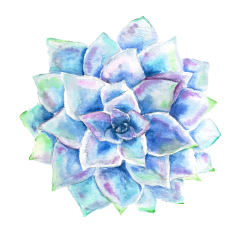
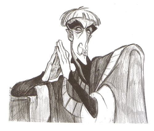
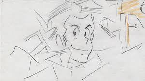
 (Concept art done by Kathy Zielinski, Frollo)
Here are my next ten favorite character designs. Again, this is a list not about whether I like their personalities or emotional depth (though their design plays a heavy role in this). There are some characters I love in films, like Hiccup, but can’t stand the way they were designed. (Ugliness is not a factor. I love well done ugly characters.) It is hard to explain really. MOVING ON . . . . .

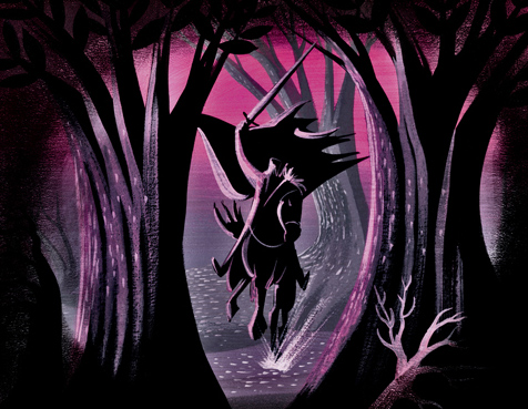
40. Headless Horsemen- “Tale of Ichabod Crane” (1949)
Ward Kimball headed (no pun intended) the whole chase scene in the Tale of Ichabod Crane, however John Lounsbery designed Brom Bones who played the horsemen so perhaps he is responsible? I don’t know. They don’t really specify. This character just. . .. looks. . . cool. He was robed in a dark purple cloak, wielded a glowing sword, and held a pumpkin head (I LOVE PUMPKINS). Everything about him adheres to those old stories that I heard as a child about specters of the night. I love how he rode his horse (which is sort of part of his character if you think about it) especially when he leapt from atop a cliff and landed as if it was nothing. And that laugh! Ahhh! I just love him! Cough. . . you get the idea.

39. Lupin III- The Castle of Caligiostro (1979)
Maurice Leblanc designed the original character Arsène Lupin for many different novels and comics, however for the manga and two later anime series Monkey Punch is accredited for his design. My favorite design comes from the 1979 film, which debuted the phenomenal director, designer and writer Hayao Miyazaki. In this film, Miyazaki headed for the first time the storyboards and character designs. I have never seen the anime series, however I did watch this film a few years ago and thought it was pleasant and fun. I like how Lupin III looks in this film. He still retained that goofiness from the second anime series (I watched a few clips, but haven’t seen the series.) yet something about how he moves and looks in this film just appeals more to me. It was smoother and purer. I like his long legs and his sideburns, but mostly it is the eyes. They look so open and intelligent.


38. Genie- Aladdin (1992)
I debated long and hard whether I should put genie on this list, but after awhile I just knew I had to. I don’t like Aladdin that much but I LOVE Robin Williams rendition of this Arabian Night character. I love his design, just like with Sherkan, because he looks like Robin Williams to me and his endless enthusiasm. Eric Goldberg headed the genie’s design and I love the work he and the other animators put into making him such a likable character. Unlike the genie in The Thief of Baghdad (1940), who is scary beyond all reason, this genie’s design shows him to be witty, sporatic and. . . well just like Robin Williams. What I like most about him is his facial features, from his quirky eyebrows, expressive eyes, down hooked nose and brilliant white smile. I also like his curling beard.
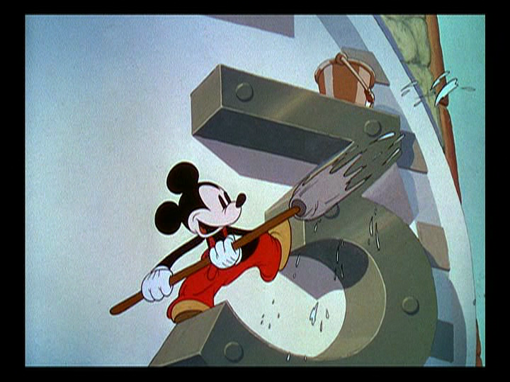
37. Mickey Mouse- (1935-1938)
I am not into collecting popular characters or obsessing over popular icons (aka hello kitty, Betty Boop, Bugs Bunny etc). Recently through my Memorable Moments in Animation, I watched many of the old cartoons featuring Mickey Mouse in some of his more popular shorts from 1935-1940. In “Clock Cleaners” I loved the way he looked and watched several other cartoons from this period just to see him. He looked ritzier and has that lovely classic cartoon feel about him. I didn’t like the original design done in the 1920’s, because he looked too mean. In the newer designs he looks too. . . human. When he is dressed in his red overall pants, with his dotted eyes, white face, gloves and black skin I like him best.
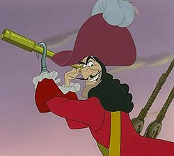
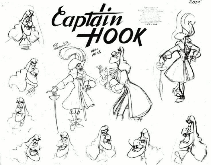
36. Captain Hook- Peter Pan (1953)
Frank Thomas was the leading director for Captain Hook’s design. I thoroughly enjoy watching Captain Hook and how sporadically his moods change. I love it when characters don’t remain a single personality or look an entire film, hence why I like Genie as well. As for Hook, I love his many different facial expressions that range from downright furious, devious, exasperated and delusional. My favorite scene, which shows his most radical changes, is when the crocodile comes. His mustache twitched with each striking of the clock and his eyes bulged in fear. When he falls into the water, oh how I love watching him swimming from one end of the crocodile to the other and screeching like a girl. I also like his voluptuous hair, lean build and most importantly his stately mustache. He also has a big nose!

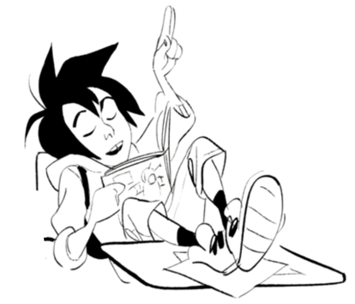
35. Hiro Hamada- Big Hero 6 (2014)
Here is my third 3D animated character! Shiyoon Kim was Hiro’s head designer (as far as I know) and for a 3D animated film she and her team did a wonderful job. I like his scrawny frame, crooked teeth, messy hair, gangly hands but most importantly HIS EYES. They are so expressive! Throughout the whole film I couldn’t help staring at them. I think this was a result of combining American and Japanese character designs and concepts. Unlike previous films depicting tweens, Hiro through his character development physically and emotionally was sweet and very realistic to me. I always enjoy eccentric characters like Hook and Genie but in my heart of hearts it is the quiet unassuming designs that I love the best. This is a character still growing into himself and it showed wonderfully through his design.
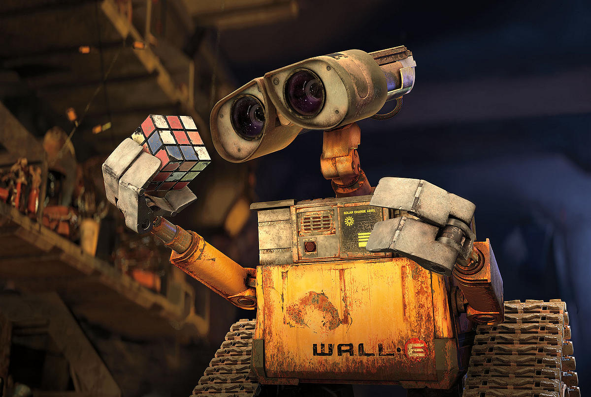
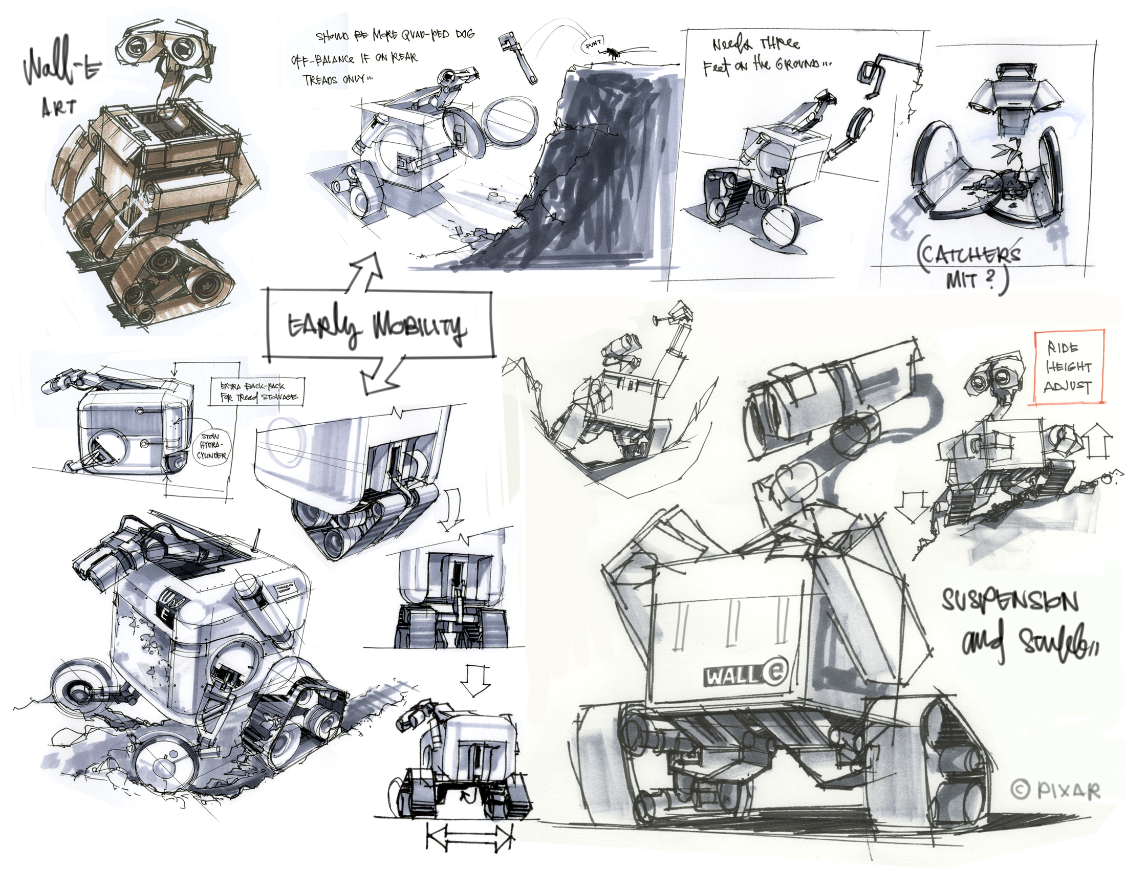
34. Wall-E- Wall-E (2008)
I usually only think round things are cute. Even in his own way, Toothless had a roundness about his features. That is not the case for the fun-loving robot Wall-E , yet I find him irresistibly adorable. Andrew Stanton really was the mind behind his design, in fact, I think he was particularly attached to this movie. I like how animators wanted Wall-E to look somewhat expressionless like Buster Keaton, (in the sense that the robots didn’t need mouths and noses to have expression and emotions). That is what makes Wall-E so great. His binocular like eyes always look so enduring especially in the way they droop and curve up above his square frame. That is what gives him such lasting personality. I also like how his “hands”curve away from his body. But we all know the real reason why we love him is his voice and curiosity.

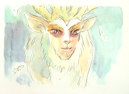
33. The Forest Spirit- Princess Mononoke (1997)
We come to yet another design done by Hayao Miyazaki. I love the way this character looks in its many different forms. My favorite though is when he is transforming into the night walker. There is something otherworldly about this character, as if it is an ethereal being separate from human beings yet irrevocably connected to them. I love his human-like red mask, elk like frame and soft gliding walking style. He represents nature, which cannot be controlled or used for mankind’s purposes without terrible consequences. There is such wisdom, love and gentleness behind his eyes that even as an animated character I cannot help but stand in awe of his presence.

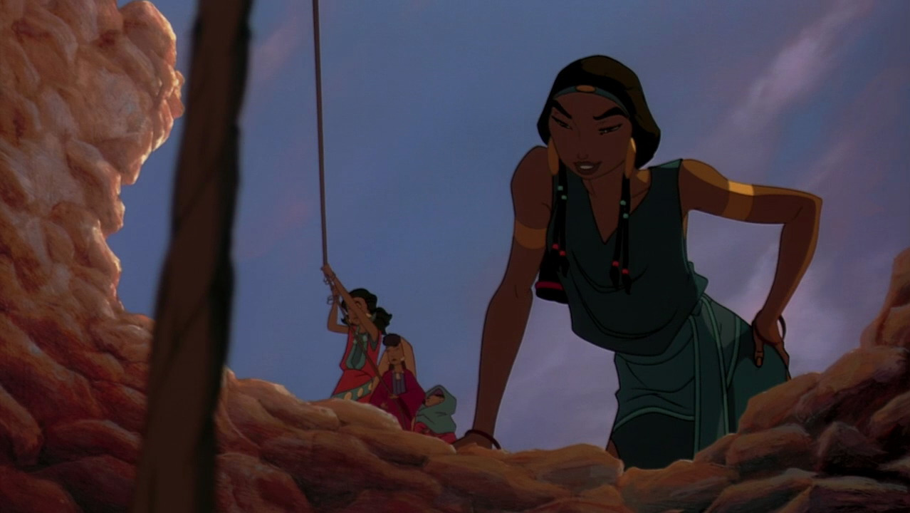


32. Yocheved/ Tzipporah- The Prince of Egypt (1998)
I could not decide between these two characters, so I decided to put them in the same slot. (Aurea Terribili and Julia Wolf headed Yocheved’s design and Tanja Majerus and Dawn Pierce did Tzipporah.) For Yocheved, Moses’s mother, I loved the feminine, graceful lines put into her design, especially in her face. All the characters in this film have an air of maturity different than the more cartoony style of many of Disney’s films. Her hair is sumptuous, but not overtly so, covered well with red cloth. Ofra Haza provided her singing voice in “Deliver Us”, whose beauty was so entrancing they based Yocheved’s design from her. She isn’t seen for very long, however her presence is never lost as Ofra Haza continued to provide excerpts of song into the musical score throughout the film. What I love most about Tzipporah’s design is her maturity. She definately looks like a woman and not a spry young girl. She had already grown into herself and had a air of pride that showed best in her eyes, facial structure and proud stance. I also love her hair, especially in the way it is shaped into thick braids and when it gets wet.


31. Bear- The Fox and the Hound (1981)
This bear’s scene is the highlight of this otherwise boring film. Glen Keane designed and animated this character as well as his attack on Copper and Tod. Most of the film everything is calm, sad or slow-paced (if not a little dull). However, the minute the bear rambles onto the scene everything on the screen changed. This was no cuddly Pocahontas (1995) Bear. No, it was enraged, feral and dangerous. This is one of those moments in animation where you have to stop and just look in awe at art in motion. I love the gleam on his fur, his piercing, red eyes, and oppressing form. Keane put so much attention into the small details of the bear’s design, movements and on the fight it is no wonder he is considered a Disney Legend.
For my previous post click here: Memorable Designs, 50-41
